Year
2026
Client
SCHOOL
Category
BRAND DESIGN
Product Duration
3 - 4 Weeks
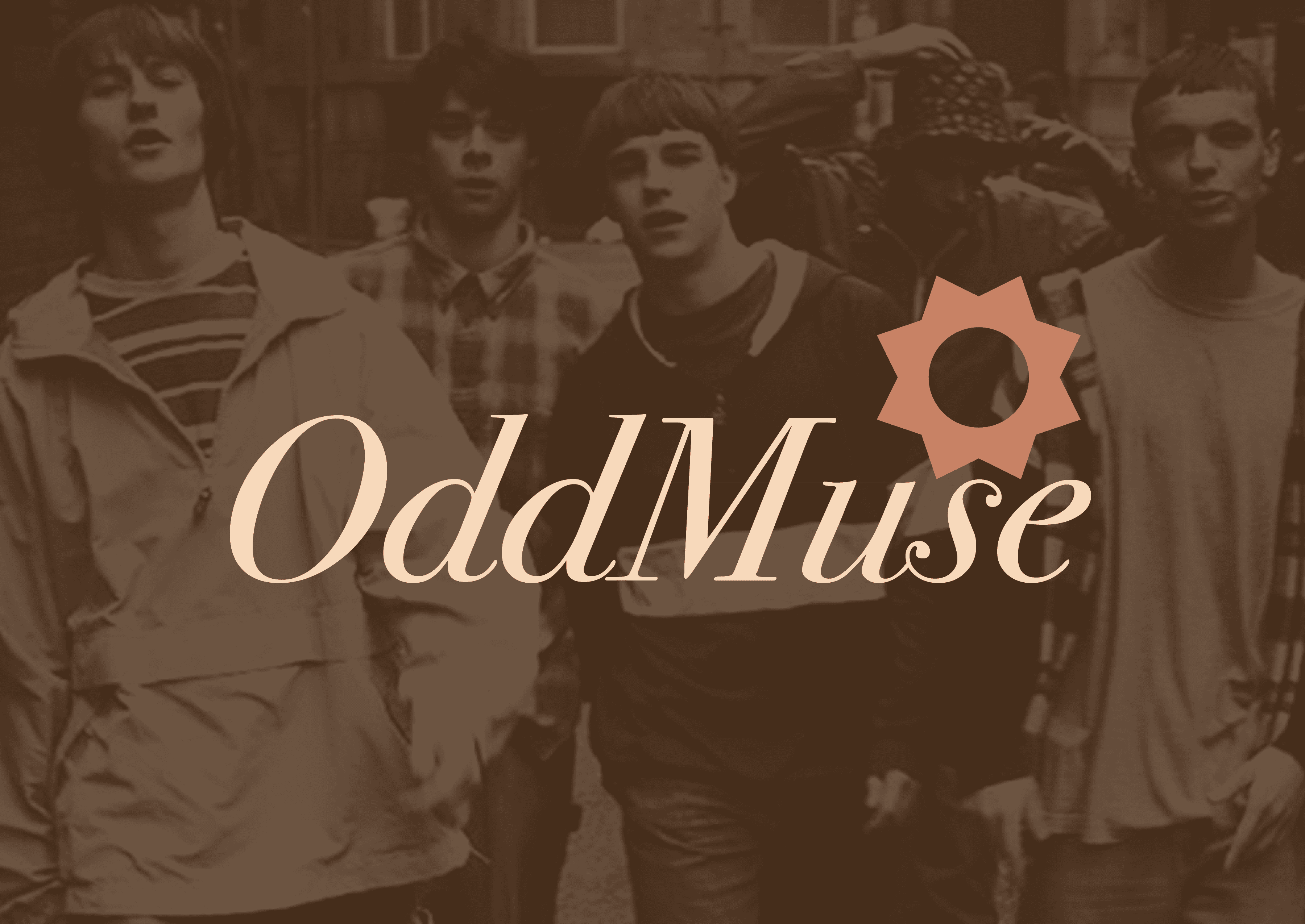
I explored several directions before landing on the final identity, experimenting with more modern, clean aesthetics before deciding they felt too expected for a brand like this. The final design leans into a deliberate tension between old and new — vintage-inspired typography and muted, aged colour tones sit alongside a sun-shaped mark that symbolizes an emerging trend breaking through. The result is a brand that feels familiar but distinctly its own.
I started with a bold streetwear direction clean lines, heavy sans-serif typography, and a modern aesthetic that felt current. While it looked strong, it felt too expected for a brand called OddMuse. The name itself suggested something stranger and more distinctive, so I pushed further. I shifted toward a vintage-inspired approach, introducing aged colour tones, period-appropriate typography, and a sun mark that symbolizes something new breaking through the surface. The tension between old and new became the core concept a brand that feels familiar but refuses to fit neatly into any existing category.