Year
2024
Client
SCHOOL (SAIT)
Category
BRAND DESIGN
Product Duration
5-7 WEEKS
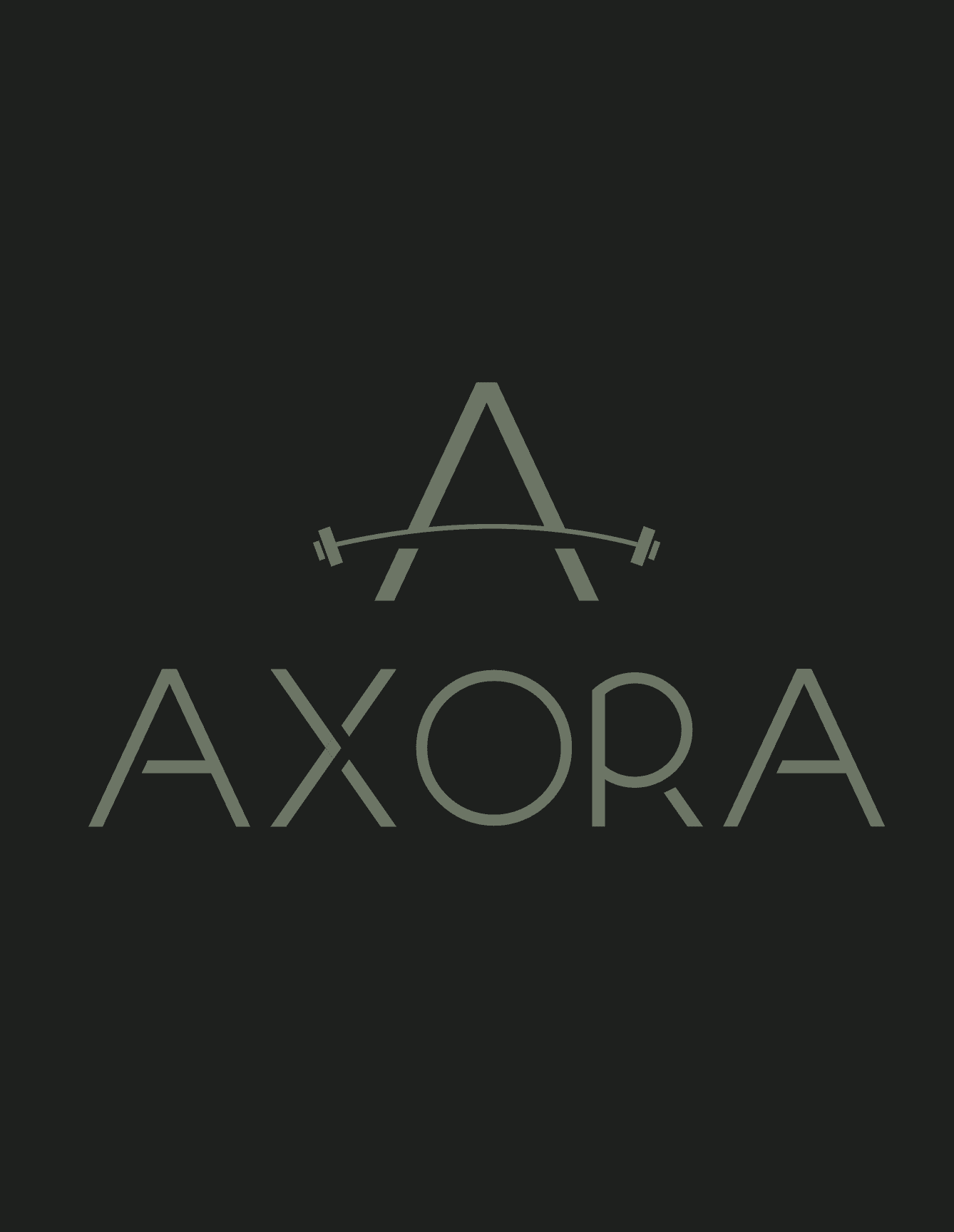
I explored several concepts early on, including bolder, more aggressive directions that leaned into typical gym brand conventions. I ultimately rejected these because they blended into the competition rather than standing apart. The final design centres on a clean wordmark paired with a thin, minimal logo mark — details that quietly signal luxury without shouting it. The palette of green and off-grey creates an organic, almost lifestyle-brand feel that separates Axora from darker, more intimidating competitors and speaks directly to a style-conscious audience.
My first direction was a minimalist black and white identity clean, strong, and timeless. It worked technically but blended into a crowded space where many premium brands already occupy that territory. I wanted Axora to feel elite without feeling cold, so I introduced colour as a differentiator. The final palette of green and off-grey creates an organic, almost lifestyle-brand warmth that separates it from the darker, more aggressive gym brands on the market. The wordmark was kept clean and thin to reinforce the luxury positioning without relying on the colour alone to do that work.