Year
2025
Client
School (SAIT)
Category
Magazine Design
Product Duration
3 - 4 Weeks
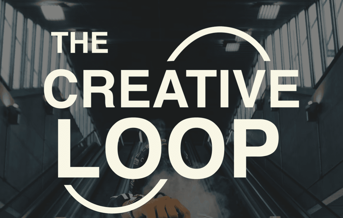
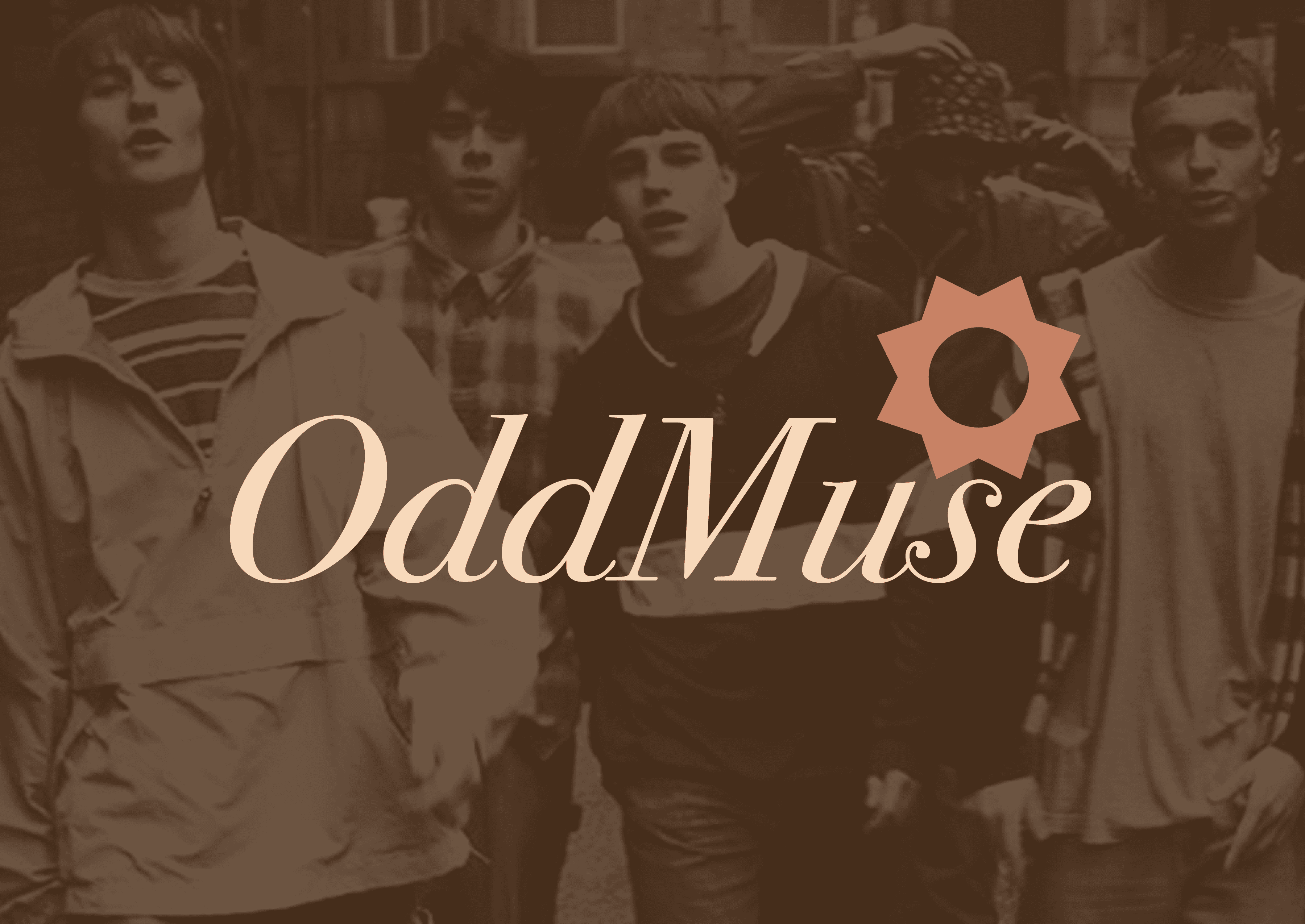
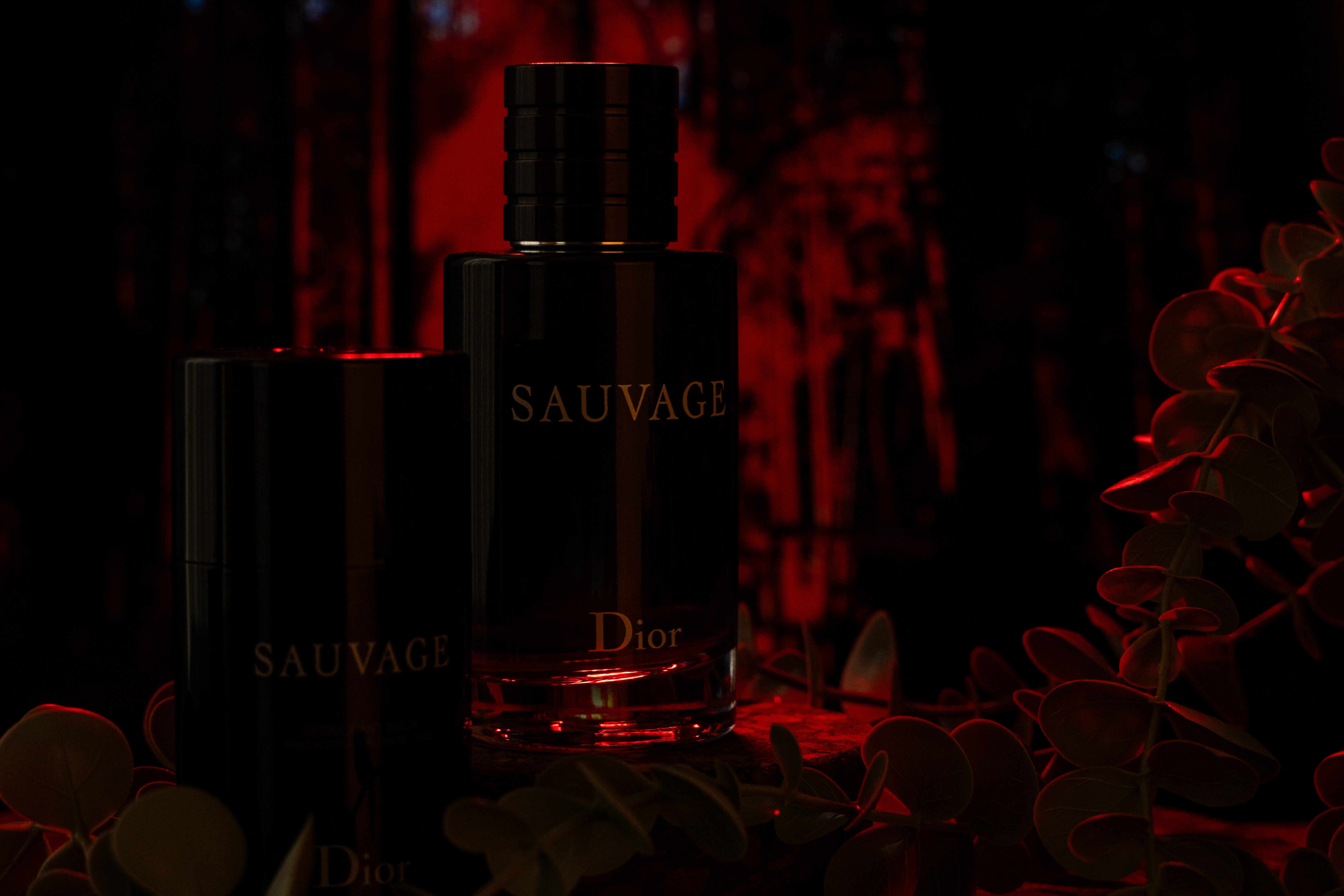
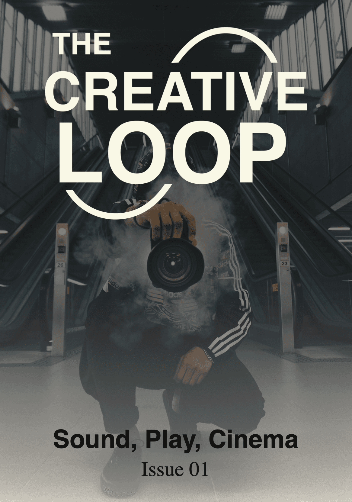
The core challenge was designing a single visual identity that felt at home across three very different creative fields without defaulting to a generic "catch-all" aesthetic. I explored several directions before settling on a bold, high-energy layout language that captures the passion shared across music, gaming, and design communities. Strong typographic hierarchy and high-contrast imagery drive each spread, while the overall layout system is consistent enough to tie the magazine together as a cohesive publication. The basketball imagery used in the mockups was chosen to represent the competitive, performance-driven mindset that connects all three fields — the drive to create, compete, and push boundaries.
The challenge from the start was designing a single identity that felt equally at home across music, video games, and graphic design three fields with very different visual cultures. Rather than defaulting to one as the anchor and building outward, I worked across all three simultaneously, looking for the visual language they share rather than what separates them. What connects them is energy, passion, and a culture built around making things. The layout system I developed leans into bold typography, high contrast, and dynamic compositions that feel fast-paced and expressive qualities that resonate across all three communities. The result is a magazine that doesn't feel like it belongs to any one scene, but feels instantly familiar to anyone who is part of the creative world.